
Creating Responsive Branding
If I asked you to give me an example of strong branding, which company would come to mind? I’d place a hard bet that there are brands you can identify by a single symbol or even a colour - and although this sort of staying power takes time to create, setting your brand up to ensure it can recognized regardless of the context its in is a great place to start. Although this concept isn’t new, and should be the principle for any brand development project, I wanted to cover a few examples if you aren’t familiar with it.
WHAT IS RESPONSIVE BRANDING?
A designer who is creating a responsive logo takes into consideration the variety of contexts in which it will be used, and realizes any limitations that might come into play. Based on size, scale, positioning etc., they’ll create a suite of logos that will hold strong regardless of where the logo is used. The logo that you’ll use as your Instagram avatar will probably be much smaller than the one used on your business card, but will need to be legible and communicative in both instances!
In short, you’ll likely have a “master” logo, then 2-3 secondary versions or submarks that will allow your branding to be just as prominent whether it’s 1 inch wide on a screen or 50 feet tall on a billboard. It should always be visually appealing and readable.
ELEMENTS OF RESPONSIVE BRANDS
Colour is such an important part of your brand’s aesthetic. However, I wholeheartedly believe that any logo should be able to stand on its own in black and white. During my design process, I present clients with their brand in multiple contexts so that they can easily visualize it - but I always ensure that it wows in its purest form. Responsive branding takes a similar approach, where as some logos that incorporate decorative elements or additional text strip those away piece by piece to create a responsive set. This can include, but is not limited to a full logo, 1-2 slightly condensed versions/orientations, and an icon or submark.
This example is from responsivelogos.co.uk, and illustrates the concepts perfectly.

(A VERY MINI) CASE STUDY
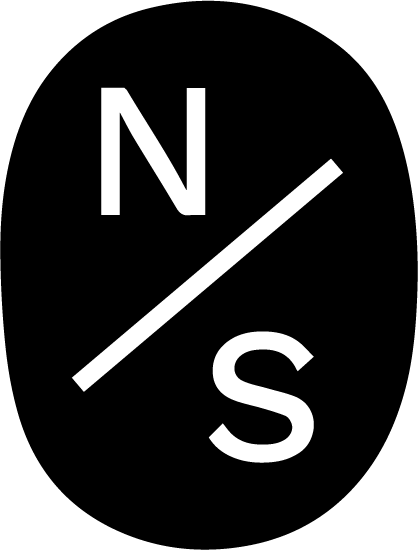
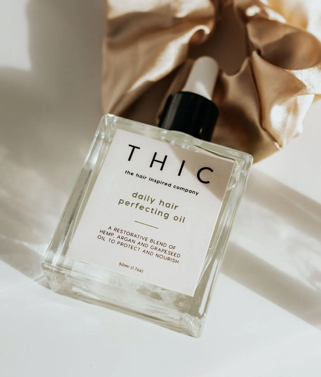
The logo suite below was developed for The Hair Inspired Company. While working on this project, I knew that the brand was going to grow into a place where there would be multiple products, sold through both digital and physical retail channels. Therefore, the brand would need a responsive logo set that could work well on social media, on product packaging, labels, website, online ads and more. The results are below!


